We may have unravelled the "Big Guys" selling plan !!!
- (where by may have I mean likely, but not absolute)
All we really had to do to unfold this was to follow "The Bear" on 3 trips toward its goal:
1) thru the daily path,
2) thru the weekly path, and
3) thru the monthly path.
The Bear left very clear prints of where it had been and pointed out to us where it is most likely going. We don't need much of an explanation here, as the graphs below speak for themselves. Remember, the market moves in cycles and hits resistance and support levels along the way. For example, as a market travels a long way through an entire Bear market, it will meet (and need to break through) many support levels along the way. And, the support levels get harder to break through the further down they are.
So far, in the last 12 months the market has waffled back and forth for a record number of times for any prior 12-month period in market history, and has started what appears to be a big market drop. It could be a "correction" (drop of less than 20%) or a full-out "market crash" (i.e., a drop greater than 20%, and as far down as 40-60%).
The graphs below are:
Graph #1 - Daily graph,
Graph #2 - Weekly graph, and
Graph #3 - Monthly graph.
From its path in Graph #1 below, you will see that the S&P 500 (as represented by the ETF SPY), experienced an all-time high in May 2015 at 210.4 (about 2140 on the SP500 index) and has since broken key support levels on the way down at 204.0 202.0 200.0 187.0 182.0 and then it failed to break and stay below 181.0. In fact, the SPY failed to break and stay below 181.0 three times in the last 15 months (10/15/2014, 8/24/2015, and 1/20/2016).
Of course, this "Bear Path" is the work of the big guys. They try to hide their selling, but good technical analysis can expose them. The fat kats use volatility to try to "hide" their path; but again, good technical analysis can expose them. First we must make some sense out of the daily movements, and then the story gets more and more understandable as we move from the highly volatile daily graphs to the smoother, less distracting weekly and monthly graphs. In actuality, when we get to monthly graphs, the story is very obvious, clear, and telling.
In the past when similar patterns happened, the market has gone into full-fledged market crashes. Of course, that is just my personal analysis. But, MIPS is greatly different and is much more comprehensive. In addition to this type of analysis, MIPS uses other, much more comprehensive and reliable ways of determining which way the market is headed.
So, stay tuned and let MIPS guide us until the present plan runs its course.
- BTW, don't fear the Bear, as MIPS will take us short and we will greatly benefit from the market's
demise.
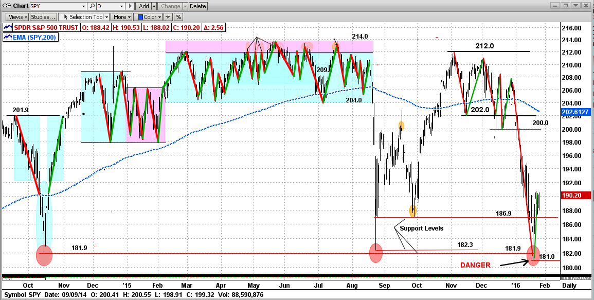
Graph #1 - Daily graph
See the 181.0 support levels at 10/15/2014, 8/24/2015 and 1/20/2016
- pink ellipses in the graph below
What I see here is strong support at 181.0
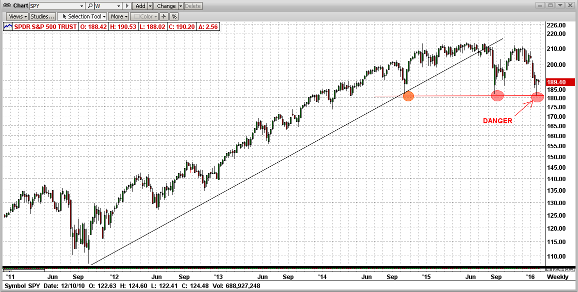
Graph #2 - Weekly graph
See the 181.0 support levels at 10/15/2014, 8/24/2015 and 1/20/2016
- pink ellipses in the graph below
What I see here is a broken trend and several strong attempts to crash (all failed at 181.0)
(Double Top ???)
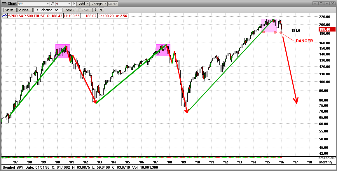
Graph #3 - Monthly graph
See the 181.0 support levels at 10/15/2014, 8/24/2015 and 1/20/2016
- pink ellipses in the graph below
What I see here is a "topping" process that has run its course, with three attempts to break down hard, as in 2000 and 2008.
(Isn't it amazing that the volatility and waffling in all of Graph #1 is in the last three monthly bars below?)
Good trading !!!


