site map
my account
contact
our facebook page
Latest Posts
Archive

+
...

Market Timing

Friday, January 29 2016

We may have unravelled the "Big Guys" selling plan !!!
- (where by may have I mean likely, but not absolute)

All we really had to do to unfold this was to follow "The Bear" on 3 trips toward its goal:
   1) thru the daily path,
   2) thru the weekly path, and
   3) thru the monthly path.

The Bear left very clear prints of where it had been and pointed out to us where it is most likely going. We don't need much of an explanation here, as the graphs below speak for themselves. Remember, the market moves in cycles and hits resistance and support levels along the way.  For example, as a market travels a long way through an entire Bear market, it will meet (and need to break through) many support levels along the way.  And, the support levels get harder to break through the further down they are. 

So far, in the last 12 months the market has waffled back and forth for a record number of times for any prior 12-month period in market history, and has started what appears to be a big market drop. It could be a "correction" (drop of less than 20%) or a full-out "market crash" (i.e., a drop greater than 20%, and as far down as 40-60%). 

The graphs below are:
  Graph #1 - Daily graph,
  Graph #2 - Weekly graph, and 
  Graph #3 - Monthly graph.

From its path in Graph #1 below, you will see that the S&P 500 (as represented by the ETF SPY), experienced an all-time high in May 2015 at 210.4 (about 2140 on the SP500 index) and has since broken key support levels on the way down at  204.0  202.0   200.0  187.0   182.0  and then it failed to break and stay below 181.0.  In fact, the SPY failed to break and stay below 181.0 three times in the last 15 months (10/15/2014, 8/24/2015, and 1/20/2016).

Of course, this "Bear Path" is the work of the big guys.  They try to hide their selling, but good technical analysis can expose them.  The fat kats use volatility to try to "hide" their path; but again, good technical analysis can expose them.  First we must make some sense out of the daily movements, and then the story gets more and more understandable as we move from the highly volatile daily graphs to the smoother, less distracting weekly and monthly graphs.  In actuality, when we get to monthly graphs, the story is very obvious, clear, and telling.

In the past when similar patterns happened, the market has gone into full-fledged market crashes.  Of course, that is just my personal analysis.  But, MIPS is greatly different and is much more comprehensive.  In addition to this type of analysis, MIPS uses other, much more comprehensive and reliable ways of determining which way the market is headed.

So, stay tuned and let MIPS guide us until the present plan runs its course.
- BTW, don't fear the Bear, as MIPS will take us short and we will greatly benefit from the market's
  demise.


Graph #1 - Daily graph
See the 181.0 support levels at 10/15/2014, 8/24/2015 and 1/20/2016
- pink ellipses in the graph below
What I see here is strong support at 181.0


Graph #2 - Weekly graph
See the 181.0 support levels at 10/15/2014, 8/24/2015 and 1/20/2016
- pink ellipses in the graph below
What I see here is a broken trend and several strong attempts to crash (all failed at 181.0)
 (Double Top ???)


Graph #3 - Monthly graph
See the 181.0 support levels at 10/15/2014, 8/24/2015 and 1/20/2016
- pink ellipses in the graph below
What I see here is a "topping" process that has run its course, with three attempts to break down hard, as in 2000 and 2008. 
(Isn't it amazing that the  volatility and waffling in all of Graph #1 is in the last three monthly bars below?)

Good trading !!!
 

Posted by: Dr. G. Paul Distefano AT 12:29 am   |  Permalink   |  Email
Monday, January 18 2016

Is the Bear Upon Us

We are smothered with "data and opinions" every day now that prove the market is heading for big trouble.  This bad news is now centered around things like China's slowing economy and failing stock market (yes failing, not just falling); bad U.S. numbers on manufacturing output and retail buying; falling oil prices; fear that the Fed will reverse its course and start QE again, etc.  Even if we knew for sure that all of this reported data was accurate, we would still not be able to figure out the impact on the stock market.

So, what good is this data if it cannot help us decide how it will affect the market.  I am not sure about that, but I do think that there is an "indirect" way we can participate in the correct market moves.  Institutional investors like Goldman Sachs, Morgan Stanley, UBS, etc. (the "fat kats") all have large staffs of hundreds of "Analysts" that analyze this data for them.  Please understand that whatever actions the fat kats implement from their Analysts' recommendations are almost always 100% accurate, if you measure "accurate" by whether or not the market moves the way the analysts said it would.  Well folks, if the fat kats buy, the market goes up whether or not it should; and if the fat kats sell, the market goes down whether or not if should.  In other words, the price action of the market "follows the money".

This is not because the fat kats know which way the market should be going, it's because the market moves the way the fat kats push it (fat kats buying leads to up markets, and fat kats selling leads to market drops).

So, since we cannot predict the way the market will move, we seek to identify the way the fat kats are trading (buying or selling) and mimic them.  MIPS capitalizes on this the by using "volume weighted data", where price action on high volume has a greater impact on the MIPS models than price action on lower volume.

[About a month ago we wrote a blog entitled "Is the Market Topping?"  This was about how the fat kats "dump" their positions when the market is "topping" (i.e., turning from a bull market to a bear market).  See  http://www.mipstiming.com/blog/view/8682/is_the_market_topping_]

We actually thought that there was a good chance that the market was topping then, and we think so even more nowIn the graph below, you can see that we have recently ALMOST completed this latest topping cycle, like the cycles from the start of previous Bear Markets (in 2000 and 2008); including two drops below the SPY's 200-day EMA (where "ALMOST" is explained below this graph).


"ALMOST"

I used the word "Almost" above because there are a couple of things that have to happen before I would "bet-the-farm" on the big crash starting now !!!

The main requirement for the big crash to happen soon is that the SPY has to break through several more very strong "Support Levels" (see graph below).  As you can see, so far the SPY has broken support levels at 202.0 on 1/04/16, and 199.9 on 1/06/16.  Then the SPY dropped all the way down below the even stronger support at 186.9 on 1/15/16 (Friday), but closed above that level at day end. That could signal a reversal.

To turn into a market crash, the SPY still needs to break through strong resistance at 186.9 and 182.36 and finally at 181.9.  Seems like quite a task, but the lower support level at 181.9 is only about 3% from Friday's close.  Even if this all happens in the next few days/weeks, the bulls could still want this market to "top" for several more months before giving in to the bears.

BTW:  MIPS3 and MIPS4 went to cash on 12/30/15, and short on 1/08/16...

Stay tuned...

Posted by: Dr. G. Paul Distefano AT 01:13 am   |  Permalink   |  Email
Saturday, January 09 2016

To successfully manage their "Nest Egg", everyone needs a good "Asset Allocation" plan.  An Asset Allocation plan defines how much of your life savings you plan to allocate to real estate, commodities, equities, bonds, alternate investments (art, etc.), and cash.

This "lesson" is limited to how to go about investing your equities money (i.e., stocks, ETFs, etc.).

Needless to say, most individual investors do not do well investing in equities, especially the ones who manage their own money.  Some use RIA (Registered Investment Advisor) firms, and hope for the best because they have no idea how the firm will manage their money.  Still, that is a better approach than trying to trade against the pros by yourself.

This lesson is for individual investors who manage their own money (that is, buy-and-hold or trade for themselves).  Please be aware that there is no real, concrete definition of a "Buy-and-Hold" strategy.  For example, does it mean to pick, say, 30 stocks (as in the Dow) and hold them for retirement or for your kids/grandkids?  If so, you would not have done well in the past, because most of the stocks in the Dow fifty years ago are gone. 

And, the Dow has NOT been made up of the same 30 stocks for many years.  When one of the Dow stocks goes bankrupt (like FW Woolworth), the Dow replaces it with another (like Walmart).  Thanks.  If I had a brokerage firm that would do that for me, I would buy-and-hold with them. 

And, what about buying-and-holding say 10-15 mutual funds?  Do you think that the fund management team is not trading in those funds. Many "turn over" 50-100% of their portfolio every year.  Does buying a fund and letting the managers trade their butts off with your money in their fund make this a buy-and-hold strategy?  Why is that different than you trading those stocks yourself?  Does buy-and-hold mean that, if you buy a basket of stocks (as in a fund), and let someone other than yourself trade those stocks all year long (while you watch from the sidelines), that makes it a buy-and-hold strategy?  But if you make those trades yourself, NOT ?

Anyway, most individual investors do trade, but it is at random and is usually the opposite of what they should be doing.  I know, because I did just that myself for over 20 years.  We watch Apple go up like a rocket and THEN we buy in.  Shortly thereafter, Apple dives, and we switch to another stock that has been skyrocketing, like Amazon.  Then we do the same thing with Amazon and Google, etc., over-and-over.

Most individual investors do the same thing with timing models as explained above for stocks. They subscribe to one model, and if it takes a relatively small "hit", they change models and continue the same process, over-and-over.

We are almost guaranteed to not do well in the stock market without two basic principles:
  1) a good, specific strategy (like how, when, what to trade), and
  2) the discipline to follow through with our strategy, WITHOUT emotion.

I am going to tell you how to implement something like that above and show you one way to improve on what you have been doing; in some cases by 400% or more... read on.

First, let's assume that we would be content with buy-and-hold if we could find high quality "Indices" in the world that would perform 3-4 times better than the S&P 500 (or its ETF, SPY) over say an 8-10 year period, with less than 1/3 of the drawdown of the SPY.  Would that be a correct assumption?  And, would you trade a little to accomplish this?  If so, read on.

Let me show you what could be 3 of those types of ETFs from other countries on our planet (or something else) that performed as above. But first, let's establish the performance of our benchmark (the SPY).

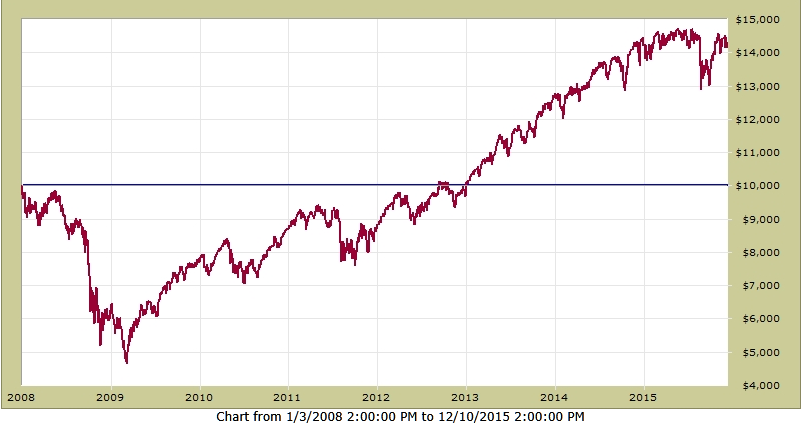
In the graph below, you will see that from 2008-2015, buying-and-holding the SPY would have:
   1) grown a $100,000 investment to $143,000 (multiply right-hand scale by 10)
   2) produced a compounded annual growth rate (CAGR) = 4.5%
   3) experienced a Maximum Drawdown = -53.5%


Could we have found other investments that would have beaten this significantly?  OK, let's look at some other investments that we present herein say as "Indices" from other high-quality countries.  See 3 of those below:

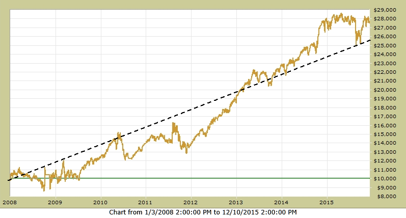
Country A - from 2008-2015, buying-and-holding the Country A Index would have:
   1) grown a $100,000 investment to $240,000 (multiply right-hand scale by 10)
   2) produced a compounded annual growth rate (CAGR) = 13%
   3) experienced a Maximum Drawdown = -28%


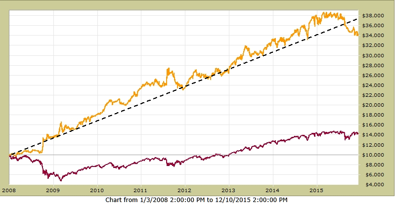
Country B - from 2008-2015, buying-and-holding the Country B Index would have:
   1) grown a $100,000 investment to $280,000 (multiply right-hand scale by 10)
   2) produced a compounded annual growth rate (CAGR) = 14%
   3) experienced a Maximum Drawdown = -24%


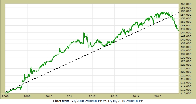
Country C - from 2008-2015, buying-and-holding the Country C Index would have:
   1) grown a $100,000 investment to $450,000 (multiply right-hand scale by 10)
   2) produced a compounded annual growth rate (CAGR) = 21%
   3) experienced a Maximum Drawdown = -19%


MIXING

Our investment strategy would be to diversify our risk by placing a portion of our total equity money in each of these Indices. By investing 30% of our equity money in Country A; 30% in Country B; and 40% in Country C, the performance would be:

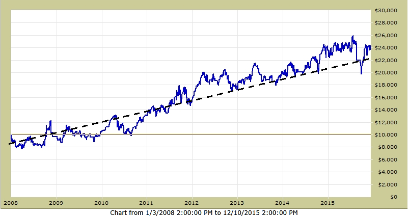
Combo - from 2008-2015, buying-and-holding the Country Indices and "mixing" as above would have:
   1) grown a $100,000 investment to $350,000 (multiply right-hand scale by 10)
   2) produced a compounded annual growth rate (CAGR) = 17%
   3) experienced a Maximum Drawdown = -16%

       Combo is Gold;     Country A is Blue;     Country B is Light Brown;     Country C is Green


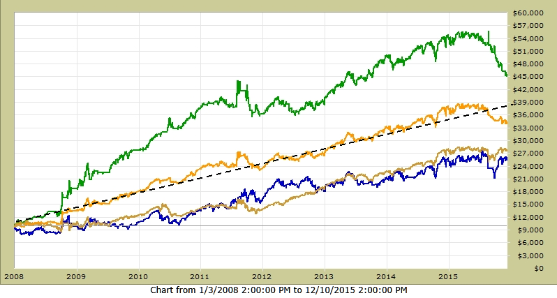
Compared to buying-and-holding the SPY, the above strategy of "mixing" good indices does MUCH better, with VERY LITTLE RISK (Max DD=-17% vs -53% from the SPY)... see below !!!


Now "The Lesson"... 

First, I have some bad news and some good news !!!

The bad news is that, even though the graphs above are "verified" actual performance, they are NOT Indices from other countries (sorry, but I needed to do that to get and keep your attention).

The good news is that the results in the graphs above (that are reported as from Country Indices) are from actual good, live models like MIPS.  To make my point, I used MIPS3 as Country C and picked two other models from developers that I know that have verified results on TimerTrac.com for over 10 years. I know others (like on ThetaResearch.com) that are as good or better than the other two presented herein.

My point is that many individual investors who can tolerate 40-50% drawdowns from buy/hold of good mutual funds or from a group of large-cap stocks in the US or Europe, cannot seem to tolerate even a 20% drawdown from a timing model (or better yet, a combination of 2-3 good models) even though these models have outperformed the Indices/Funds by 300-400% !!! 

Caution:
Please be aware that you cannot just pick 2-3 good timing models, mix them, and expect to get similar performance and lower drawdowns from the "mix".  To get lower drawdowns, the individual models CANNOT be based on the same principles (like trend-following, reversion to the mean, sector rotation, etc). When the models are based on different principles, most of the time they have their "bad periods" at different times and this "smooths" the performance.  For example, if you were using 3 models and one of them had a -15% drawdown when the other two were flat, the resulting drawdown for the "mix" would only be -5%.  Etc, etc, etc...

Going Forward:
I am not in a position to "recommend" other models but I can tell you what to look for.  And, we have several RIAs that use the MIPS models "mixed" with 4-5 other very good models, and their results have been amazing.  I can introduce you to them.  Feel free to contact me !!!

Paul Distefano, PhD
CEO / Founder
MIPS Timing Systems, LLC

Posted by: Dr. G. Paul Distefano AT 09:46 pm   |  Permalink   |  Email
Thursday, January 07 2016

"Topping" is when the big guys are selling at a market top over a 12-15 month period; and when they have offloaded most of their huge long positions, they start shorting and driving the market through the floor.

The way this works is that an institutional investor decides to dump, say, 200 million shares of GE.  Every week or so, they sell their GE position all the way down between $28 to $23/share, and they depend on the little guys to "buy on the dip" and drive the stock price back up from $23 to $28/share, over-and-over again.

The process ends when the big guys have sold most of the long positions that they wanted to unload.  And, when the process does end, the market crashes (down 45-60%).  

See the last two crashes below (2000 and 2008) and beware. Please see that the bars in the graph below are monthly bars, so the topping process took 12-14 months in these two years.  Looks like the same is happening in 2015-16.

There is no reason to panic, mainly because once these shrinking markets start dropping, they take at least 12-18 months to run their course (i.e., for the Dow to drop like 7,500 points).  We just need to wait until MIPS sees the big crash actually happening and takes us to cash and then short.

Of course, this crazy market could turn around and roar back up...

Stay tuned !!!

Posted by: Dr. G. Paul Distefano AT 06:05 pm   |  Permalink   |  Email

MIPS Timing Systems
P.O. Box 925214
Houston, TX  77292

An affordable and efficient stock market timing tool. Contact MIPS
281-251-MIPS (6477)
E-mail: support@mipstiming.com